

Web3 Landing Page Design Psychology Explained
Grooic
CRO
The most effective Web3 landing pages convert through psychology, not just visuals. They build trust in emerging blockchain technology by using clear messaging, visual hierarchy, and cognitive triggers that guide user decisions. Design psychology transforms a complex Web3 concept into a credible and emotionally engaging experience.
Understanding User Psychology in Web3 Landing Pages
A well-designed Web3 landing page speaks to both logic and emotion. Web3 audiences are early adopters, but they still look for proof, community, and simplicity. The design should answer three subconscious questions within the first five seconds:
Is this project trustworthy?
What does it solve for me?
How do I get started?
When the layout, color system, and copywriting align with these triggers, bounce rates drop, and conversions increase naturally.

Unlike Web2 landing pages, Web3 interfaces must reduce cognitive friction. Too many technical terms, token metrics, or wallet prompts cause early exits. Visitors decide emotionally before reading the fine print. A clean, human-centered design communicates authority without overcomplicating blockchain narratives.
Key Psychological Principles Behind High-Converting Web3 Designs
Every design choice should serve one behavioral outcome: trust. The most successful Web3 startups use visual and linguistic cues that anchor credibility and anticipation.
Visual Hierarchy
Place your primary call-to-action where the eye lands first. White space, contrast, and typography guide scanning behavior.
Social Validation
Display community numbers, notable investors, or exchange listings to trigger social proof. Humans imitate trust signals from groups.
Cognitive Fluency
Use simple patterns and repetition to make complex ideas feel familiar. Predictable design structures increase perceived ease of use.
Temporal Urgency
Highlight launch timelines, staking windows, or presale progress bars. Urgency drives immediate engagement without manipulation.
Emotional Anchoring
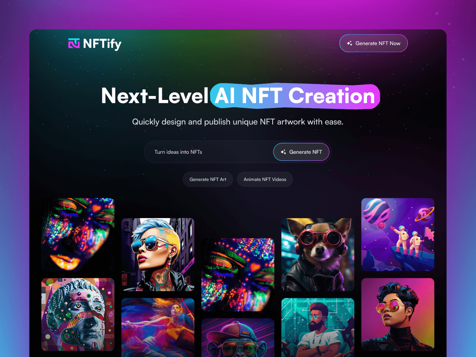
Blend motion design with color psychology. For example, dark gradients and minimal neon tones create a sense of innovation and mystery, aligning with crypto culture.
How Design Psychology Increases Web3 Conversions
A landing page that reduces mental load creates confidence and commitment. When users understand your purpose in under seven seconds, their engagement curve grows exponentially.
This process follows the Attention → Clarity → Commitment model:
Attention: Captured through hero motion visuals and one-sentence clarity.
Clarity: Built through scannable features, simplified token explanations, and visual proof of functionality.
Commitment: Encouraged by transparent CTAs, user feedback, and conversion reinforcement (testimonials, metrics, or media coverage).
The best Web3 landing pages don’t sell blockchain; they sell trust in blockchain through psychology-backed layout patterns.
Design Triggers That Build Trust and Engagement
Trust design is measurable and repeatable. Each visual and interactive element serves a cognitive purpose.
Psychological Trigger | Design Example | Conversion Impact |
|---|---|---|
Visual Proof | “Powered by Polygon” logo or audit badge | Increases trust signals |
Familiar Layout | Hero → Features → Proof → CTA structure | Enhances navigation confidence |
Scarcity Display | “Limited Mint Supply” counters | Raises urgency metrics |
Motion Anchors | Micro animations guiding scroll flow | Improves dwell time |
Consistency | Same CTA color and tone throughout | Builds subconscious stability |
A Web3 audience expects technological authority. Showing too little structure creates doubt, but overloading design complexity creates anxiety. The balance point is clear order within creative expression.
Frequently Asked Questions


Want to Launch Faster?
Get a high-converting landing page instantly with our premium templates.


