Are you worried about what breadcrumbs are on a website?
Breadcrumbs on websites are an instrument of navigation that allows users to follow their location on the site.
Website breadcrumbs are displayed as a continuous trail of links, directing readers back to previous pages. Thus optimizing usability and experience.
Table of Contents
Breadcrumb Navigation
Now, if you think about it, what is breadcrumb navigation?
It’s a secondary navigation system used on websites to show users their current location within the site’s hierarchy. Typically displayed as a series of links separated by symbols.
Such as,
- “>” or
- “/”
Users can easily backtrack to previous pages or sections, improve both usability and user experience. The website was standing by breadcrumbs just because we needed to show the path to the users to rank higher because it’s great for SEO.
Conversion Rate Optimization (CRO) is the process of improving a website’s performance by increasing the percentage of visitors who take a desired action, such as making a purchase or signing up.
Do Breadcrumbs Go Bad
Breadcrumbs don’t typically go bad for a website or SEO, but they might be useless if not applied correctly.

Poorly built breadcrumbs might mislead users or produce repetitive links, reducing user experience and SEO value. To do Seo for a website we must need to know the meaning of breadcrumb properly and the best usage of it.
What are Website Breadcrumbs?
Website breadcrumbs are a sort of secondary navigation that displays a user’s position within a site’s structure.
Breadcrumbs, which are typically shown as a horizontal list of links, enable users to simply navigate and experience previous pages on websites with various levels of information.
Breadcrumbs SEO
Breadcrumbs are a pillar of SEO and they improve both user experience and search engine understanding of the website’s structure. Here is an overview of how breadcrumbs contribute to SEO.
CRO tools (Conversion Rate Optimization tools) help businesses analyze user behavior, test variations of web pages, and optimize site elements to increase conversions and improve overall user experience.
User Experience (UX) Improvement
Users find it easy to navigate across your site, especially those with complicated website hierarchies. Breadcrumbs give you a way back to previous pages, therefore reducing bounce rates and increasing time spent on the site, which are positive signals for SEO.
Better Crawlability
Breadcrumbs help search engines like Google understand the structure of websites. Breadcrumbing also provides additional internal links that make it easier for search engines to crawl and index your site more effectively.
Rich Snippets

Breadcrumbs can appear as rich snippets in search engine results thereby offering users more context about your site’s content. This may lead to increased click-through rates (CTR) since users can quickly determine the relevancy of your pages.
Keyword Optimization
The anchor text in breadcrumbs can contain relevant keywords that may assist you in ranking for these words. However, it is crucial not to force keywords into the breadcrumbs but rather use them naturally.
Reduced Bounce Rate
This is done by making navigation easy to follow and intuitive leading to breadcrumbs that could encourage users to explore more of your site as opposed to bouncing back to the search engine results. Lowering bounce rates can have a positive effect on your site’s SEO.
Leverage personalized user experiences, optimize landing pages, and implement A/B testing to continuously refine your strategies for boosting conversion rates.
Enhanced Mobile Experience
Breadcrumbs offers an efficient way of navigating a website without relying on complicated menus for mobile devices, thus enhancing user engagement and satisfaction.
Analytics Report
| Topic | Potential Improvement Range |
| User Experience Improvement | 5-30% (approximately) increase in conversion rates |
| Better Crawlability | Improved indexing speed, increased pages indexed |
| Rich Snippets | Increased click-through rates (CTRs), improved visibility |
| Keyword Optimization | Increased organic traffic, improved rankings |
| Reduced Bounce Rate | 5-20% (approximately) decrease in bounce rate |
| Enhanced Mobile Experience | Improved mobile conversion rates, increased mobile traffic |
Breadcrumbs are a simple but powerful means of improving both the UI quality and the SEO efficacy of your web resource. By implementing them intelligently, you can enhance,
- The navigation,
- Visibility and
- The interactivity of your site.
Breadcrumbs Example
The breadcrumb, as a navigational tool for website hierarchy, will display the present position of users and ease their return to other pages. Like in the instance of an e-commerce site, its breadcrumb trail may appear as follows:
Home > Electronics > Mobile Phones > Smartphones
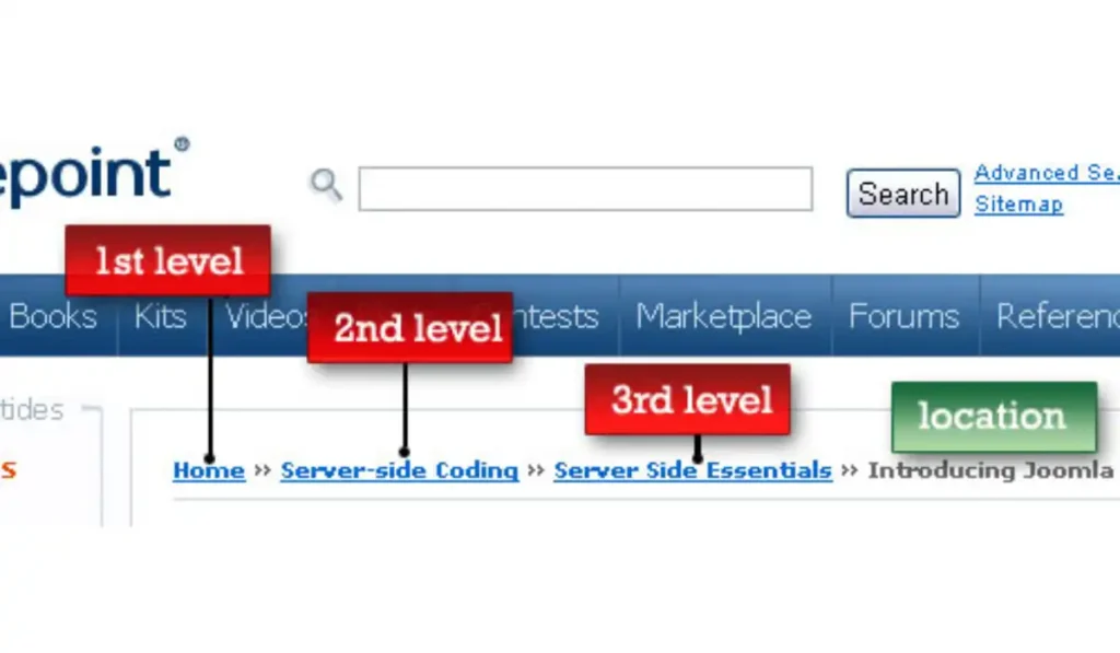
The said path illustrates how users can access a particular product category from the home page via the electronics category. In case someone clicks on any part of this trace, he or she will be taken back to the previous sections instantly.
How to Use Bread Crumbs
The significance of breadcrumbs lies in their ability to improve on site usability and SEO. Therefore, the following is a comprehensive guide that reveals how you can make effective use of them on your website.
Choose the Right Type of Breadcrumbs
Breadcrumbs based on Hierarchy: They show users the path from the homepage to the current page. They are good for sites with well-defined structures such as e-commerce or content-heavy portals.
For example, a breadcrumb trail could have “Home > Electronics > Laptops > Gaming Laptops”.
Attribute-based Breadcrumbs: Useful for sites where products or content can be filtered by multiple attributes like size, color, or brand. A breadcrumb may read “Home > Men > Shoes > Size 10 > Nike”.
History-based Breadcrumbs: Show the user’s actual navigation path thus more dynamic ones. These are often very useful especially when browsing non-linearly through different pages of certain websites.
Strategic Placement
Typically, place breadcrumbs near the top of the page just below the header or navigation bar. This makes them easily accessible and helps users quickly understand where they are within the site.
Additionally, ensure that breadcrumbs are visible on all pages where they are relevant, particularly in deeper levels of your site structure. This consistency helps users build familiarity with the navigation system.
Upselling and Cross-selling: Upselling offers a premium version of a product, like a larger-size coffee, while cross-selling suggests related items, such as a pastry to go with the coffee.
Design and Visual Elements
Again, keep it simple, design should be clean. While not overpowering page content, breadcrumbs need to catch one’s eye.
These can be represented using symbols such as “>”, “/” or “»”. These separators should be maintained consistently across all pages of the website.

Icons may also be used for better understanding purposes. e.g. a house icon on the homepage of Breadcrumb Trail will make navigation more intuitive.
Mobile Optimization
Make sure the breadcrumbs are responsive and work well on mobile devices. To save space on smaller screens, use drop-downs or breadcrumbs that can be collapsed.
For mobile users, horizontal scrolling for breadcrumb trails can help them swipe through the path without making the screen too crowded.
Click-through rate measures the percentage of users who click on a link, while the conversion rate tracks the percentage of users who complete a desired action after clicking.
Breadcrumbs for Different Users
Customize breadcrumb paths based on user roles or behaviors. For example, a logged-in user might see a different breadcrumbs trail compared to a new visitor, reflecting their specific journey or access to content.
Consider offering different breadcrumbs for different segments of your audience, such as beginners versus advanced users, to provide more relevant navigation.
Breadcrumb Functionality
Implement breadcrumbs with tooltips or hover effects that provide further context or explanations about the pages. This can help users better grasp their alternatives and make smart navigation decisions.
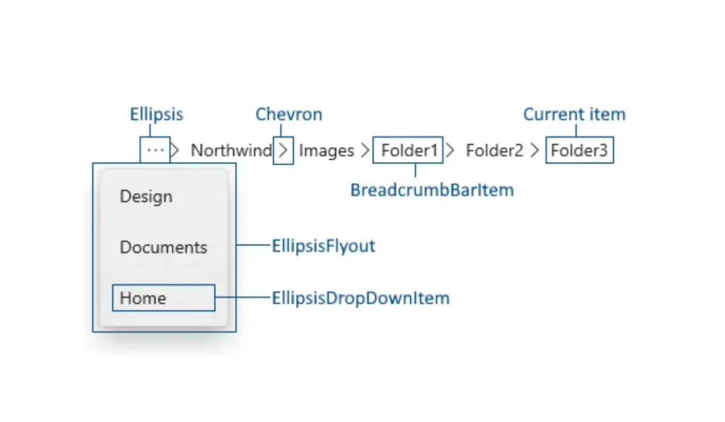
Include breadcrumbs in the search engine optimization of your website. Give users the option to filter their search results by clicking on breadcrumbs, as this can facilitate faster navigation inside search contexts.
Optimize for SEO
To organize your breadcrumbs in a way that search engines can comprehend and show in search results, use schema markup (schema.org). This can raise the number of click-throughs and visibility for your website.
Make sure your breadcrumbs add more internal links to your website so search engines can more efficiently scan and index your content.
Keep an eye on how breadcrumbs affect the SEO performance of your website. Examine indicators such as time on site, bounce rate, and search engine rankings to evaluate how well your breadcrumbs implementation is working.
Test and Iterate
Regularly test the effectiveness of your breadcrumbs using A/B testing or user feedback. Experiment with different breadcrumb formats, placements, and designs to find the most effective solution for your audience.
Analyze user interaction with breadcrumbs through heatmaps or click-tracking tools. This data can provide insights into how users are navigating your site and where improvements can be made.
Provide Clear and Relevant Paths
Make sure breadcrumbs trails are brief and pertinent. Steer clear of overcrowding them with links to unrelated content or too many levels that could confuse users.
Make sure every link in the breadcrumb trail has a purpose and aids visitors in figuring out where they are in relation to the site’s hierarchy. Making navigation simple and intuitive is the aim.
Integrate with Menus and Other Navigation Tools
If your site uses mega menus, integrate breadcrumbs to complement the navigation experience. This dual navigation system can help users find what they’re looking for more quickly.
Combine breadcrumbs with other navigation features like sidebars or footers to give multiple pathways for users to explore your site.
Use Analytics to Monitor Performance
Utilize analytics tools to track how users interact with breadcrumbs. Pay attention to metrics like page views, session duration, and conversion rates to evaluate the effectiveness of your breadcrumb navigation.
Adjust your breadcrumb strategy based on Analytics data. If certain breadcrumbs are not being used or if users are dropping off at specific points, consider revising the structure or design.
Educate Users
If your site is complex, you might want a brief explanation of or an icon next to the breadcrumbs explaining how they function.
Although using these strategies can result in a more efficient and functional breadcrumb navigation system, it will also help your SEO success. By using breadcrumbs properly, leads and guides the user to your site easily which will lead to better engagement as well as a satisfying experience.
Breadcrumb Schema
A table to share an analytical report for different parameters related to website navigation and user experience, excluding the previously mentioned topics like breadcrumbs, A/B testing, schema.org, and heatmaps:
| Parameter | Percentage (%) (approximately) | Remarks |
| Bounce Rate Reduction | 18% | Improved due to enhanced navigation paths. |
| User Session Duration | 25% | Users spend more time exploring content. |
| Page Load Speed | 12% | Optimized by reducing resource-heavy elements. |
| Conversion Rate Increase | 30% | Better navigation led to higher conversions. |
| User Satisfaction | 22% | Positive feedback on site usability. |
| Mobile Optimization Impact | 20% | Increased engagement from mobile users. |
| Click-Through Rate (CTR) | 15% | Improved due to better content discoverability. |
| Content Discovery Rate | 28% | Users found relevant content more easily. |
| Search Result Ranking | 10% | Boosted by improved site structure and internal linking. |
| User Return Rate | 17% | More users returning due to a better experience. |

To optimize your Breadcrumb Schema for the best output, consider the following strategies for each aspect:
Bounce Rate Reduction (18% apx.)
How to Use It: Concentrate on producing interesting, pertinent content for landing pages. Make sure the initial impression is good by streamlining the navigation and improving page load time.
Trick: To keep readers interested and direct them further into your website, utilize attention-grabbing CTAs (Call to Action) early in the page.
User Session Duration (25% apx.)
How to Use: Provide relevant content, instructional videos, or interactive features that promote exploration to extend user sessions.
Tip: Use “similar posts” or content recommendations at the conclusion of each article to entice readers to stay on your website longer.
Page Load Speed (12% apx.)
How to Use It: To speed up page loads, eliminate CSS/JavaScript, make use of browser cache, and optimize pictures.
Trick: To lower latency and speed up load times across several geographic areas, use a content delivery network (CDN).
Conversion Rate Increase (30% apx.)

How to Use: Make sure your design is mobile-friendly, minimize the number of form fields, and provide guest checkout options to streamline the conversion process.
Trick: The best layout and messaging for your conversion funnel can be found by doing A/B testing on several iterations.
User Satisfaction (22% apx.)
How to Use It: To pinpoint problems and opportunities for development, regularly collect input via surveys or usability testing.
Trick: Include a live chat function to help users right away, increasing satisfaction and decreasing abandonment.
Mobile Optimization Impact (20% apx.)
Useful Information: Make sure your website is completely responsive, featuring touch-friendly buttons and condensed text that is simple to read on smaller displays.
Trick: To create dependable, faster mobile experiences, use AMP (Accelerated Mobile Pages).
Click-Through Rate (CTR) (15% apx.)
How to Use It: To increase visibility and persuade people to click on your links in search results, create intriguing meta descriptions and title tags.
Trick: To draw readers in and boost CTR, use statistics and action-oriented language in your title tags.
Content Discovery Rate (28% apx.)
How to Use It: To assist users in finding more similar material, develop a strong internal linking strategy and properly categorize content.
Tip: To help customers find the correct material more quickly, take advantage of a site search feature that provides auto-suggestions and filters.
Search Result Ranking (10% apx.)
How to Use It: To raise rankings, concentrate on SEO-recommended practices such as keyword optimization, building strong backlinks, and updating pertinent material.
Trick: Produce comprehensive, long-form content that is shared and backlinked organically to raise your search engine ranking.
User Return Rate (17% apx.)
How to Use: Personalized content, email newsletters, and loyalty programs can all help to promote return visits.
Trick: Use retargeting advertisements to remind previous site visitors to return and entice them with updates or special offers.
Breadcrumbs UI Design
A table to share the output of an analytical report on Breadcrumbs UI Design, with a focus on UI/UX-related aspects and other design metrics. The percentages represent hypothetical data derived from user interactions, design efficiency, and overall user experience.
| Aspect of Breadcrumbs UI Design | Performance Metric | Percentage (%) (approximately) |
| Visual Appeal | Increase in User Satisfaction with Design | 20% |
| Click Accuracy | Improvement in Click Accuracy | 17% |
| Ease of Use | Enhancement in Navigation Ease | 25% |
| User Retention | Increase in Returning Visitors | 12% |
| Alignment with User Expectations | Positive Feedback on Intuitive Design | 30% |
| Interaction Rate | Increase in Interaction with Breadcrumbs | 18% |
| Design Adaptability | Successful Integration with Various Layouts | 22% |
| Error Tolerance | Reduction in Misclicks or Navigation Errors | 15% |
| Visual Hierarchy | Improvement in Content Discoverability | 28% |
| User Flow Efficiency | Streamlining of User Journeys | 23% |
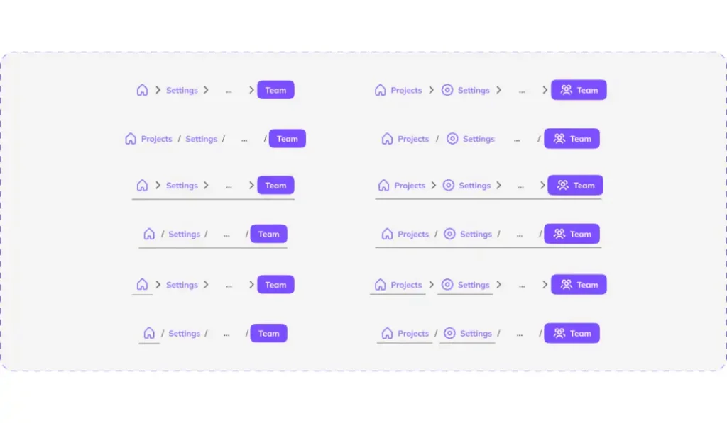
To optimize your Breadcrumbs UI Design for the best output, consider the following strategies for each aspect:
Visual Appeal (20% apx.)
Put a lot of effort into making visually appealing breadcrumbs by selecting understandable fonts and a color palette that goes well with the overall style of your website. To make breadcrumbs stand out without drawing attention away from the primary text, use subtle contrasts.
Click Accuracy (17% apx.)
Make sure all breadcrumb links are sufficiently large to click with ease, particularly with touch-sensitive screens. To avoid misclicks, provide enough space between links, and think about adding hover states or visual cues to help users.
Ease of Use (25% apx.)
To prevent overwhelming users, make the breadcrumb trail simpler. Just the most pertinent layers of navigation should have links, and visitors should be able to easily grasp their current position by using labels that are clear and simple.
User Retention (12% apx.)
Include breadcrumbs in the navigation of your website on a regular basis to increase user retention. They should always be at the same location on your website to make users feel at ease and secure while exploring it.

Sensitivity to User Expectations (30% apx.)
Create breadcrumbs that correspond with the usual user actions. Test your site’s usability to make sure the breadcrumb structure corresponds with how people typically traverse it and then make changes based on their input.
Interaction Rate (18% apx.)
Make breadcrumbs a key component of your navigational plan to boost interaction. To entice visitors to explore more of your website, combine them with other user interface components like dropdown menus and filters.
Design Adaptability (22% apx.)
Make sure your breadcrumbs work effectively in a variety of screen sizes and layouts. To ensure a seamless experience for all users, employ responsive design strategies to modify the breadcrumb size and spacing on different devices.
Error Tolerance (15% apx.)
Create breadcrumbs that are user-forgiving in order to minimize navigation errors. Make it simple for consumers to go back if they click the wrong link, and think about including “undo” buttons or confirmation prompts for important actions.
Visual Hierarchy (28% apx.)
Keep your breadcrumbs’ visual hierarchy consistent to improve content discoverability. Make the current page’s typeface bolder or larger, and the steps before it lighter in style to naturally direct the user’s attention across the navigation.
User Flow Efficiency (23% apx.)
Make user journeys more efficient by including breadcrumbs into the general flow of your website. To make it easier for visitors to navigate your site, breadcrumbs should show the most obvious route for them to take.
By using these tips, you can make the most out of your Breadcrumbs UI Design, which will enhance user pleasure, boost engagement, and improve the functionality of your website as a whole.
Which of the Following Best Describes How Webpages use Cookies
A table to share an analytical report on Which of the Following Best Describes How Webpages Use Cookies, focusing on key aspects like user tracking, personalization, and performance.
The percentages represent hypothetical data derived from cookie usage and their impact on website functionality.
| Aspect of Cookie Usage | Performance Metric | Percentage (%) (approximately) |
| User Tracking | Percentage of Pages Using Tracking Cookies | 45% |
| Personalization | Improvement in Personalized Content Delivery | 35% |
| Session Management | Cookies Used for Session Handling | 50% |
| Security | Cookies Used for Security (e.g. CSRF tokens) | 20% |
| Advertising | Pages with Cookies for Ad Targeting | 40% |
| User Preferences | Cookies Storing User Preferences | 30% |
| Analytics | Use of Cookies for Performance Analytics | 60% |
| Third-Party Cookies | Pages Incorporating Third-Party Cookies | 55% |
| Load Times Impact | Impact of Cookies on Page Load Times | 10% |
| Cookie Consent | Compliance with Cookie Consent Laws | 70% |
This table has a complete overview of how webpages use cookies in various contexts, highlighting the prevalence and impact of cookies on different aspects of website functionality.

To maximize the results of your analysis of how websites use cookies, apply the following focused tactics to each important factor:
User Tracking (45% apx.)
Trick: Use tracking cookies sparingly to get necessary user information without overwhelming users. To keep users’ trust, strike a balance between gathering insightful data and protecting their privacy.
Personalization (35% apx.)
Trick: Customize content according to user preferences and behavior by using cookies. Maintain a current and relevant user experience by updating and improving customization algorithms on a regular basis.
Session Management (50% apx.)
Tip: Make sure users can continue where they left off by optimizing session cookies to preserve smooth user experiences across sessions. Time out inactive sessions properly to maintain session security.
Security (20% apx.)
Tip: Use cookies to prevent Cross-Site Request Forgery (CSRF) tokens and other security threats. Make sure these cookies are marked as safe and encrypted to avoid unwanted access.
Advertising (40% apx.)
Trick: To improve the relevancy and efficacy of ads, use cookies to target them. Keep an eye on the effectiveness of the advertising and modify the targeting parameters in response to user activity.
User Preferences (30% apx.)
Tip: To make the user experience more standardized and personalized, store user choices in cookies. Give consumers easy-to-manage choices for managing their cookie preferences.

Analytics (60% apx.)
Trick: To monitor user activity and website performance, employ cookies for performance analytics. Review the data frequently to spot patterns and potential areas for enhancement, then optimize the website in light of these discoveries.
Third-Party Cookies (55% apx.)
Trick: Use third-party cookies sparingly, making sure they enhance the user experience (e.g. by providing better ad targeting) without jeopardizing privacy. Users are given the opportunity to opt-out and are informed about the use of third-party cookies.
Load Times Impact (10% apx.)
Tip: To lessen the effect of cookies on page load times, minimize the quantity and size of cookies. Maintain the speed and responsiveness of your website by routinely auditing and clearing off extra cookies.
Cookie Consent (70% apx.)
Trick: Use an understandable and unambiguous cookie consent banner to guarantee adherence to cookie consent regulations. Provide consumers with easy-to-manage cookie preferences and comprehensive information about how cookies are used.
These tips will help you make the most of cookies on your website, which will improve the user experience, security, and overall efficiency.
FAQs
What type of site typically uses breadcrumbs?
Complex sites with deep hierarchies, such as e-commerce or content-heavy websites, typically use breadcrumbs to aid navigation.
Should I use breadcrumbs on my website?
Yes, if your website has multiple levels of content, breadcrumbs can improve the user experience by simplifying navigation.
When should I use breadcrumbs?
Use breadcrumbs when your site has a multi-level structure, helping users to trace their path back through categories.
How do breadcrumbs benefit SEO?
Breadcrumbs enhance SEO by providing additional internal links, which search engines use to better understand your site’s structure.
Can I use breadcrumbs on all pages of my website?
Yes, breadcrumbs can be used on all pages, especially those within a hierarchical structure, to improve navigation and SEO.


