Have you ever wondered why some designs just don’t work?
It’s often due to a lack of understanding of the fundamental principles of design.
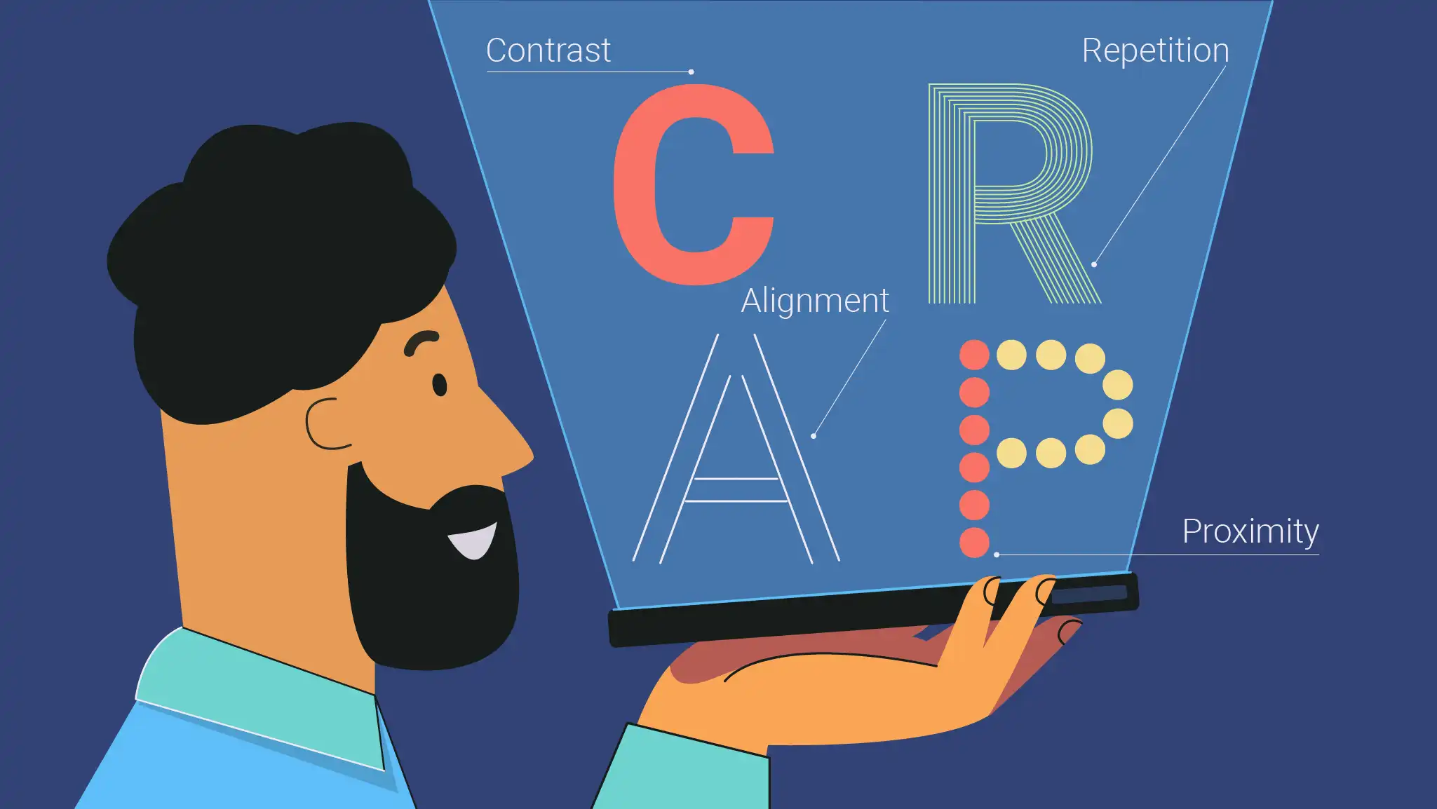
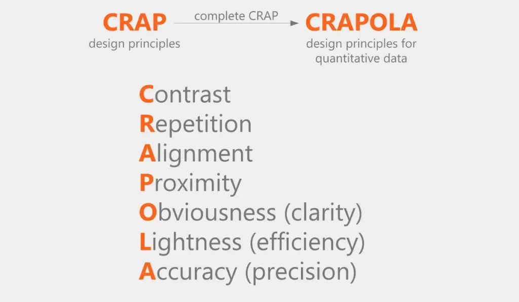
The “CRAP design principle”
- Contrast,
- Repetition,
- Alignment, and
- Proximity can transform your work.
Let’s explore how these principles can improve your design.
Table of Contents
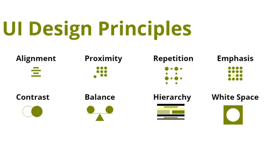
Crap in Design
In design, the CRAP acronym stands for Contrast, Repetition, Alignment and Proximity. These principles are very important when designing something that is good to look at and serves its purpose well.
- Contrast, for example, utilises colour or shape differences to act as a pointer to essential components.
- Repetition helps maintain consistency in design by replicating some visual features hence making it cohesive.
- Alignment gives orderliness and structure where elements are placed in rows that make up an organised and clean appearance of a layout.
- Lastly, proximity groups related items together which enhances their relationship leading to better readability of documents.
If these are applied then designers would be able to come up with interesting, eye-catching designs that also perform well and function properly at their intended crap design.
Applying the CRAP design principles we can improve CRO (Conversion Rate Optimization) by creating visually appealing and user-friendly designs that guide users toward desired actions.
Crap Design Principles
Designers can follow the CRAP design principles as an important guide to create attractive and efficient designs. Designers accomplish this by highlighting the main components with Contrast.
| Principle | Description |
| Contrast | Use differences in colour, size, shape, and other elements to highlight key areas and create visual interest. |
| Repetition | Repeat design elements such as colours, fonts, and shapes to create a cohesive and consistent look. |
| Alignment | Arrange elements in a way that creates order and organisation, ensuring a clean and professional appearance. |
| Proximity | Group related elements together and separate unrelated ones to improve structure and readability to maximise the conversion. |
It is therefore important to use Repetition in order to maintain uniformity in design, reinforce the theme of the design and make it more cohesive. With this Alignment, we get a sense of orderliness and professionalism which makes it easier for viewers to navigate through the design.
Lastly, Proximity clarifies the visual content by bringing together related items, thus organising and making text readable. By observing these simple rules carefully, any design project will have its quality significantly enhanced.
What Tools We Can Use To Do C.R.A.P. Graphic Design
Various tools can be used. Here are some popular tools across different categories:
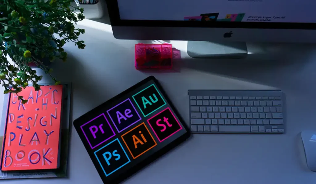
Graphic Design Tools
- Adobe Photoshop: For detailed image editing, and creating custom graphics.
- Adobe Illustrator: For creating vector graphics, logos, and illustrations.
- CorelDRAW: A powerful vector graphics editor suitable for logo design, web graphics, and more.
Layout and Publication Tools
- Adobe InDesign: Ideal for creating and laying out documents like magazines, brochures, and other print materials.
- Affinity Publisher: A cost-effective alternative to InDesign, great for layout design.
Web Design Tools
- Adobe XD: For designing user interfaces and user experiences for web and mobile applications.
- Figma: A collaborative interface design tool that allows real-time collaboration and prototyping.
- Sketch: A vector-based design tool focused on UI/UX design for web and mobile.
Online Design Tools
- Canva: User-friendly design tool for creating social media graphics, presentations, posters, and other visual content.
- Visme: Online tool for creating infographics, presentations, and other visual content.
- Crello: Similar to Canva, useful for creating engaging graphics quickly.
Prototyping Tools
- InVision: For prototyping and collaborating on interactive, high-fidelity web and mobile app designs.
- Marvel: Simplifies the process of prototyping and user testing with a straightforward interface.
Typography Tools
- Google Fonts: A free library of web fonts to enhance typography.
- Adobe Fonts: A comprehensive library of high-quality fonts.
Colour Tools
- Adobe Color: A colour scheme generator that helps in creating harmonious colour palettes.
- Coolors: A quick and easy colour scheme generator.
Other Useful Tools
- Balsamiq: For creating wireframes and low-fidelity prototypes.
- Miro: An online collaborative whiteboard platform for brainstorming and planning.
Using these tools can help designers effectively apply the CRAP principles to create visually appealing and functional designs.
With CRAP design principles, businesses can reach create visually appealing and effective cross-selling examples, such as,
Product recommendation sections on websites where related items are grouped together with consistent,
- Styling,
- Aligned neatly, and
- Highlighted using contrast to catch the customer’s eye.
Crap in Graphic Design
In graphic design, the CRAP principles are essential for creating visually compelling and effective designs.
Contrast
- Definition: Using variations in colour, size, form, and texture to highlight key features of the design and provide visual appeal is known as contrast.
- Application: Use different forms to indicate different categories of information, change the font size to highlight headers, and use contrasting colours to make the text readable against the background.
Repetition
- Definition: Utilising the same components repeatedly in a design helps to give it coherence and consistency.
- Application: To achieve a unified design, use the same colours, fonts, and visual components. This reinforces the brand’s identity and organises the design.
Alignment
- Definition: Alignment is the arrangement of pieces in a design that creates order and structure.
- Application: Ensure that text, photos, and other elements are properly aligned to provide a clean and professional appearance. Proper alignment directs the viewer’s attention and makes the design simpler to read.
Proximity
- Definition: Proximity is the process of combining similar items and isolating unrelated ones to produce a clear visual structure.
- Application: Place similar text and images together to show their link. Use white space to break up parts and increase readability.
Strategies for improving conversion by implementing the CRAP design principles can significantly improve conversion rates by creating visually appealing, organised, and user-friendly designs that effectively guide and engage visitors.
Examples and Tools for Graphic Design
Contrast:
- Example: Using a dark background with light text for a striking visual effect.
- Tools: Adobe Photoshop, Adobe Illustrator, Canva.
Repetition:
- Example: Repeating a brand’s colours and fonts across all marketing materials.
- Tools: Adobe InDesign, Figma, Sketch.
Alignment:
- Example: Aligning all text to the left to create a clean and organised look.
- Tools: Adobe InDesign, Adobe XD, Affinity Publisher.
Proximity:
- Example: Grouping a product image with its description and price to create a clear association.
- Tools: Adobe Illustrator, Figma, Canva.
Contrast Repetition Alignment and Proximity
A table summarising the CRAP principles of design, including Contrast, Repetition, Alignment, and Proximity. Along with a description for each:
| Principle | Description |
| Contrast | Use differences in colour, size, shape, and other elements to highlight key areas and create visual interest. |
| Repetition | Repeat design elements such as colours, fonts, and shapes to create a cohesive and consistent look. |
| Alignment | Arrange elements in a way that creates order and organisation, ensuring a clean and professional appearance. |
| Proximity | Group related elements together and separate unrelated ones to improve structure and readability. |
The CRAP principles of design,
- Contrast,
- Repetition,
- Alignment, and
- Proximity
These are foundational guidelines that help designers create visually appealing and effective layouts. More explanations are given below,
Contrast: This technique entails leveraging variations in features like,
- Colour,
- Size,
- Form, and
- Texture to generate visual interest and direct attention to key areas of the design.
For example, selecting a strong colour for a call-to-action button against a neutral backdrop might help it stand out and stimulate user involvement.
Repetition: Repetition is the use of the same components across a design to give a feeling of cohesiveness and consistency. This can contain,
- Repeated colours,
- Typefaces,
- Forms, and
- Other components.
For example, utilising the same font type for all headers on a website reinforces the brand identity and creates a consistent appearance.
Alignment: Alignment describes how parts in a design are organised to generate order and organisation. Proper alignment adds structure to the design, making it simpler to read and navigate.
Making sure that,
- Text,
- Photos, and
- Other components that are properly aligned will assist the viewer’s eye and improve the overall professionalism of the design.
Proximity: Proximity refers to putting similar items together and isolating irrelevant ones to produce a clear visual framework. This idea contributes to a logical flow of information making it easier for viewers to comprehend the links between various pieces.
For example, presenting a product photograph with its description and price in an advertising aids in the clear and effective communication of vital information.
By understanding and applying these principles, designers can create more engaging, effective, and visually appealing designs that communicate their intended messages clearly and effectively.
Alignment Design Principle
A table summarising the Alignment design principle with various examples and descriptions:
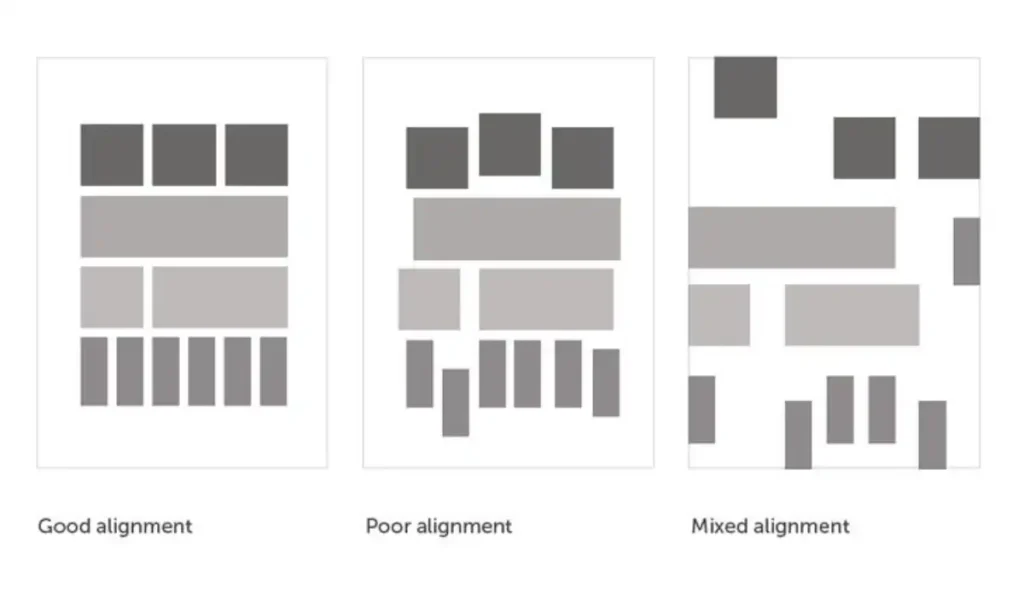
| Example | Description |
| Text Alignment | Aligning text to the left, centre, or right to create a clean and organised look. |
| Grid Layout | Using a grid system to align elements consistently across a page or screen. |
| Centred Headlines | Centre-aligning headlines to create a focal point and balance in the design. |
| Edge Alignment | Aligning images and text to a common edge to create a sense of order. |
| Alignment of Icons | Aligning icons with text labels for better readability and visual harmony. |
The notion of alignment in design is critical for achieving a clean, orderly, and professional appearance. Proper alignment ensures that pieces are positioned in a way that directs the viewer’s attention and improves readability.
For example, aligning text consistently to the left, centre, or right results in a coherent appearance. Using a grid layout allows for uniform alignment of items throughout a page or screen, making the design more organised.
What Does Putting Together of Dissimilar Elements Refer To
Contrast is commonly used in design to describe the combination of different components. Contrast is the use of various components such as,
- Colours,
- Forms,
- Sizes, and
- Textures to generate visual appeal and direct attention to certain aspects of a design.
This technique aids in highlighting,
- Crucial information,
- Creating a focus point, and
- Directing the viewer’s eye through the design.
Contrast is a design approach that encapsulates the concept of combining different components. Contrast is vital for generating visual attention and making significant features stand out.
Designers may efficiently emphasise key information and establish a focal point within a design by utilising variations in,
- Colour,
- Size,
- Shape, and
- Texture.
For example, employing a bold, bright hue for a call-to-action button on a website makes it stand out against a more muted backdrop, drawing the user’s attention to it.
Similarly, using multiple font sizes and styles can assist in distinguishing headers from body text, making the information simpler to read and navigate.
What Design Principle is Based on Repetition
The design approach based on repetition is known as Repetition. This idea is employing the same components repeatedly throughout a design to generate a sense of unity and coherence.
Designers may create a strong visual rhythm by repeating visual components like colours, forms, textures, and typefaces. This reinforces the overall theme or brand identity.
Repetition serves to direct the viewer’s attention through the design, making it more ordered and understandable. It also improves the aesthetics by generating patterns and harmony.
For example, utilising the same font type for headers and body text on all landing page/ pages of a website offers a consistent appearance and feel, which enhances the user experience.
Furthermore, repetition helps highlight key features, making them more memorable. Designers may create a balanced and professional design that successfully delivers the intended message by carefully using repetition.
Proximity Design Examples
Proximity in design refers to the spatial links between items that improve readability and organisation.
By grouping relevant objects and isolating unrelated items, designers may build clear visual frameworks that assist consumers in understanding and navigating the material. For example,
- In web design,
- Grouping navigation links together helps users navigate their way around the site.
In print design, such as,
- Business cards,
- Having a person’s name,
- Title, and
- Contact information near each other easily identifies their affiliation.
| Category | Example | Description |
| Web Design | Navigation Menu | Grouping navigation links together to indicate their relationship and making it easier for users to find related pages. |
| Print Design | Business Card | Placing a person’s name, title, and contact information close together to show their association. |
| User Interface (UI) | Form Design | Placing labels and input fields close together so users can easily associate them, improving form usability. |
| Infographics | Data Visualization | Grouping related data points together in charts or graphs to make it easier to compare and understand the information. |
| Advertisements | Product and Description | Keeping the product image and its description close together in an ad to make the connection between them clear for the viewer. |
| Packaging Design | Ingredients List and Nutritional Information | Grouping ingredients and nutritional information on a food package to help consumers quickly find and understand the product details. |
| Editorial Design | Magazine Layout | Grouping related articles, images, and captions together on a page to create a cohesive story and improve readability. |
| Event Flyers | Event Details | Placing the event title, date, time, and location in close proximity to ensure that all essential information is quickly accessible to the reader. |
| Presentation Slides | Slide Content | Keeping titles, bullet points, and images together on a slide to ensure the content is logically organised and easy to follow. |
| Retail Signage | Product Information Signs | Grouping product name, price, and key features together on signage to help customers quickly understand the product offerings. |
These concepts apply to a variety of design domains, including user interfaces and packaging, ensuring that designs are both useful and visually appealing.
FAQs
How can “bad” design be good for UX?
Bad design sometimes enhances user experiences. It can be very different and eye-catching which makes it stick in mind. If the design looks different or nonstandard, it could attract users.
For example, odd designs used in adverts often lead to a lot of talk. Individuals might like the originality and get more involved.
The aim is ultimately to leave a lasting mark and improve the user experience.
When would I want to use “crap” design principles?
In most design projects, expect to use CRAP principles. They make sure that your design is comprehensible and visually interesting.
When you want to bring out important things you use them.
For instance, in web design, they can lead users’ eyes towards key areas.
This helps to arrange a well-structured layout. CRAP principles make the content easily understandable. It is important for enhancing user navigation as well as overall experience.
Are there any examples of “crap” design being used effectively?
Yes, several productive designs use CRAP principles well. For instance, magazine layouts can be done with strong contrast and alignment.
An example is Apple’s website which employs proximity and repetition effectively. On posters, it is common to see the application of bold contrasts to catch attention.
Alignment contributes towards neatness in brochures thus giving them a professional appearance. Designers can make engaging as well as functional layouts by employing these principles.
Useful use of CRAP principles ensures that designs are attractive and easy to navigate.
Is there a risk of going overboard with “crap” design?
Definitely, there is a danger of overdoing CRAP design principles. An excess contrast may make a design appear jumbled and difficult to read.
The repetition can be done too much such that the design becomes tedious. If designs are overly aligned, they become boring and fixed in pattern.
When elements are bunched too close together (proximity), they can be confusing. The right mixture needs to be located.
CRAP principles should be used to enhance rather than overpower the design.