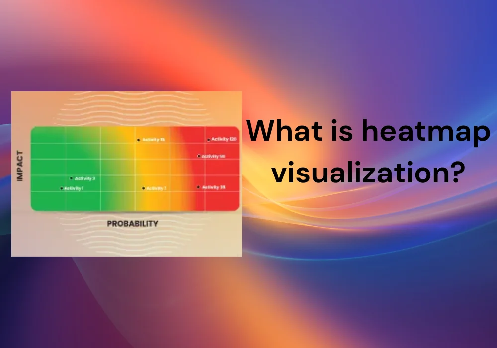
Heatmap visualization data and gives insight into complex datasets through intuitive color coding. Heatmaps transform numerical data into visual patterns that make it possible to see at a glance the direction of,
- Trends,
- Presence of connections, or
- Items that are outside the norm.
Table of Contents
What is a heat map?
To represent the size of data in two dimensions, a heat map is a good tool for visualization that uses color gradations. Each cell in the grid of the heat map corresponds to a data point with color intensity representing the value or frequency of that point.
Heat maps are especially useful for rapidly and intuitively identifying patterns, trends, and correlations within vast arrays of data. They can be found in different fields including,
- Business analytics,
- Biology,
- Geography and
- Web analytics to transform complex information into intelligible form.
Heat Map Explained/ Types/ Different Types of Heatmaps
A heat map is a plot that depicts data using colors to represent each value. This tool of imaging assists in comprehending complicated data by displaying,
- Patterns,
- Connections, and
- Irregularities using color shade changes.
Business analytics, biology, geography, and web analytics are among some of the areas where heat maps are widely used. These things will help to improve the conversion rate of a website.
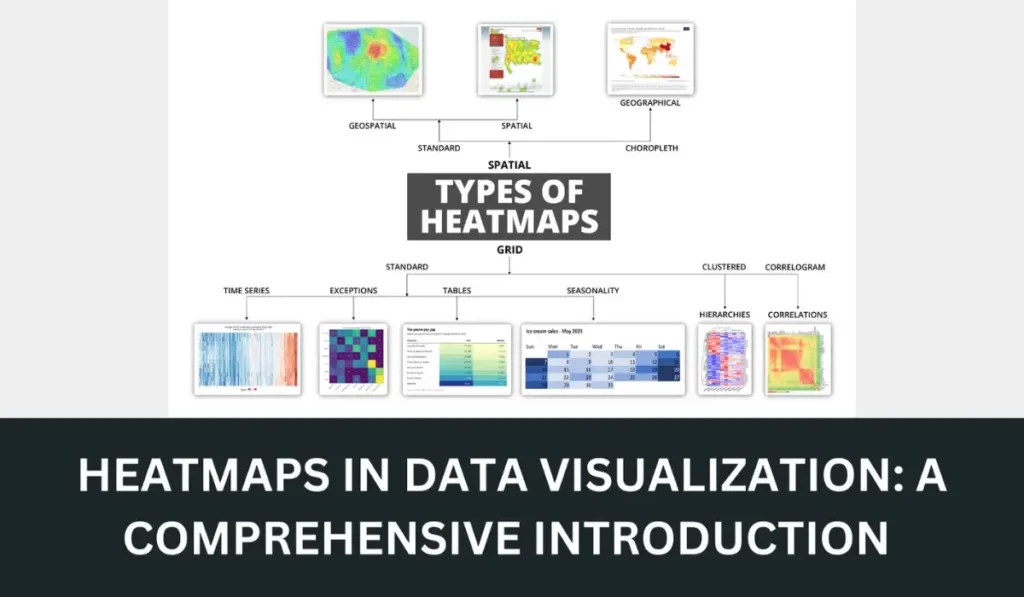
Types of Heat Maps
- Clustered Heat Maps
- Geographical Heat Maps
- Density Heat Maps
- Calendar Heat Maps
- Correlation Heat Maps
- User Activity Heat Maps
1. Clustered Heat Maps
Clustered heat maps group similar data points together, helping to identify clusters or patterns within the dataset.
| Usability | Positive Side | Negative Side |
| Data analysis, gene expression | Highlights patterns and relationships | Can be complex to interpret without proper knowledge |
| Research | Easy to compare grouped data | Requires careful selection of clustering method |
2. Geographical Heat Maps
Geographical heat maps display data over a geographical area, using color gradients to represent data intensity across regions.
| Usability | Positive Side | Negative Side |
| Marketing, epidemiology, | Provides intuitive geographical data representation | Accuracy depends on data granularity and map quality |
| Demographic studies | Easy to identify regional trends | Can be misleading if data is unevenly distributed |
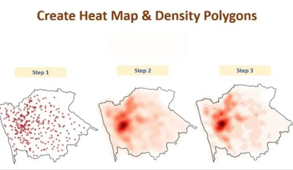
3. Density Heat Maps
Density heat maps visualize the concentration of data points within a given area, often used for spatial data.
| Usability | Positive Side | Negative Side |
| Urban planning, environmental | Clearly shows areas of high and low concentration | Can obscure individual data points |
| Studies | Effective for large datasets | Requires large amounts of data for accuracy |
4. Calendar Heat Maps
Calendar heat maps display data over time, often in the form of days, weeks, or months, highlighting temporal patterns.
| Usability | Positive Side | Negative Side |
| Time-series Analysis, | Visualizes temporal trends and patterns | Limited to temporal data |
| Productivity tracking | Easy to spot anomalies over time | Can become cluttered with dense data |
5. Correlation Heat Maps
Correlation heat maps show the relationship between different variables using color to represent the strength and direction of correlations.
| Usability | Positive Side | Negative Side |
| Statistical analysis, | Simplifies the identification of variable correlations | Can be misinterpreted without statistical knowledge |
| Research | Quick overview of relationships | Only useful for quantitative data |
6. User Activity Heat Maps
User activity heat maps track and visualize user interactions on websites or applications, such as clicks, scrolls, and mouse movements.
| Usability | Positive Side | Negative Side |
| UX/UI design, web analytics | Helps optimize user experience | May require significant data for accurate insights |
| Activity | Identifies popular and neglected areas | Can be privacy-sensitive if not anonymized |
Heat maps are flexible and powerful tools for visualization that make complex data analysis easier by bringing out trends, correlations, and anomalies. Different types of heat maps have specific uses with their own merits and demerits.
Users can derive useful insights from their data or make informed decisions by selecting the right kind of heat map based on its requirements for analysis.
How to Interpret a Heat Map?
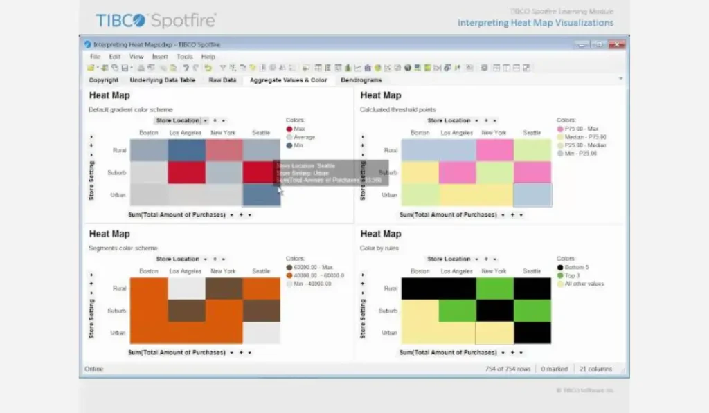
The interpretation of a heat map means understanding the color gradients and what they mean. Here is a step-by-step guide to interpreting heat map visualizations:
Know the Color Scale
A gradient of colors is used in heat maps to indicate data values. Generally, darker or more saturated colors signify higher values while lighter or less intense ones stand for low values. Check out the legend to understand the specific color coding used in your heat map.
Detect Areas with High and Low Values
Try looking for groups of darkened colors as these indicate places with high values. The light-colored areas on the other hand show low amounts. This enables one to easily identify patterns, trends, and also any outliers present in the given data set.
Recognize Patterns and Trends
Observe how colors are distributed so that you can identify if there are any patterns or trends involved. For example, if you have a geographical heatmap some locations might consistently depict high temperatures.
Similarly, it is possible to detect seasonal trends or perhaps anomalies within calendar heatmaps.
Consider the Context
Context is everything in interpretation. What does the data represent? What scale was used? For instance, areas of heavy concentration in a user activity heat map could indicate popular sections of the website.
Look at Correlations
Colors on correlation heat maps show the strength and direction of relationships between variables. A stronger correlation (whether positive or negative) will be denoted by more intense colors while weaker correlations would appear lighter.
Check for Anomalies
Note any outliers or anomalies where the color is very different from surrounding areas. These can represent unusual or unexpected data points that are interesting to follow up on.
Use the Legend
Always refer to the legend for exact understanding. The legend explains what each color means on the scale, which helps to interpret correctly.
Example Interpretation
Think about a heatmap representing web clicks:
- Red Areas: These places have loads of hits and are favorites among users.
- Yellow Areas: Some click activity takes place here.
- Green Areas: Fewer clicks occur here; implying that people are less interested in it.
- White or Light Areas: Sections with no or very few clicks as these regions are ignored by users.
By following these steps and considering context, you can effectively interpret heat maps and get insights from your data.
How to Define Heatmap of Different Types?
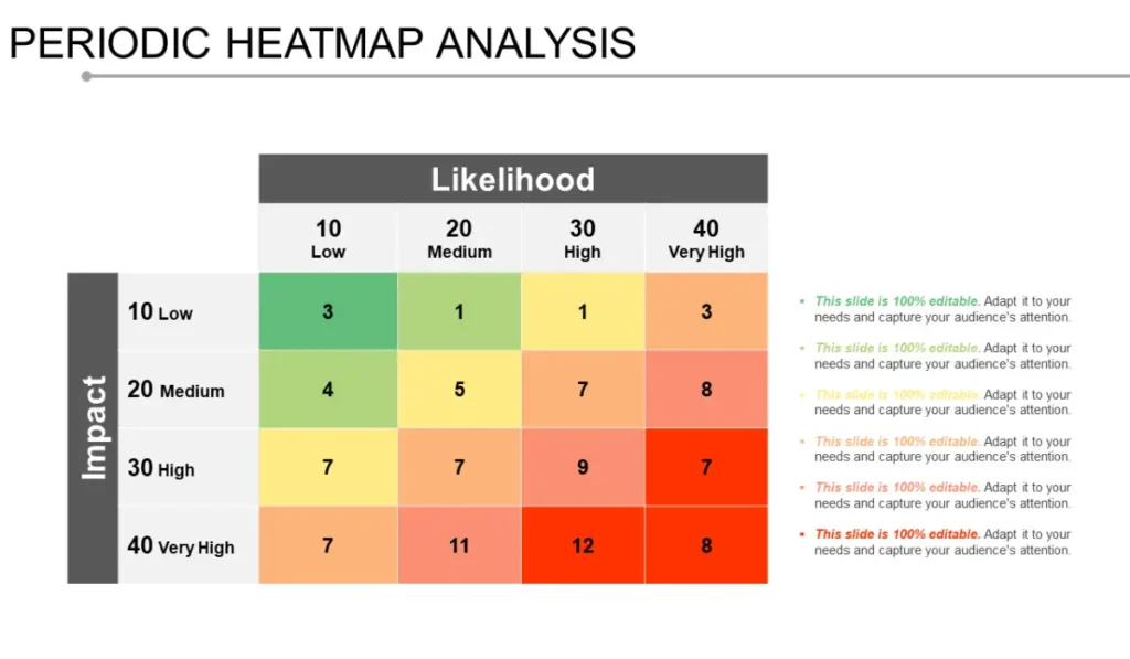
Here’s a comparison of usability, positive, and negative aspects of each heatmap type:
| Type | Usability | Positive Side | Negative Side |
| Clustered Heat Maps | Data analysis, gene expression research | Highlights patterns and relationships | Can be complex to interpret without proper knowledge |
| Geographical Heat Maps | Marketing, epidemiology, demographic studies | Provides intuitive geographical data representation | Accuracy depends on data granularity and map quality |
| Density Heat Maps | Urban planning, environmental studies | Clearly shows areas of high and low concentration | Can obscure individual data points |
| Calendar Heat Maps | Time-series analysis, productivity tracking | Visualizes temporal trends and patterns | Limited to temporal data |
| Correlation Heat Maps | Statistical analysis, research | Simplifies the identification of variable correlations | Can be misinterpreted without statistical knowledge |
| User Activity Heat Maps | UX/UI design, web analytics | Helps optimize user experience | May require significant data for accurate insights |
Understanding and defining the different types of heatmaps, along with their specific uses and limitations, enables more effective data visualization and analysis.
Heatmap Colors
Choosing the Right Colors
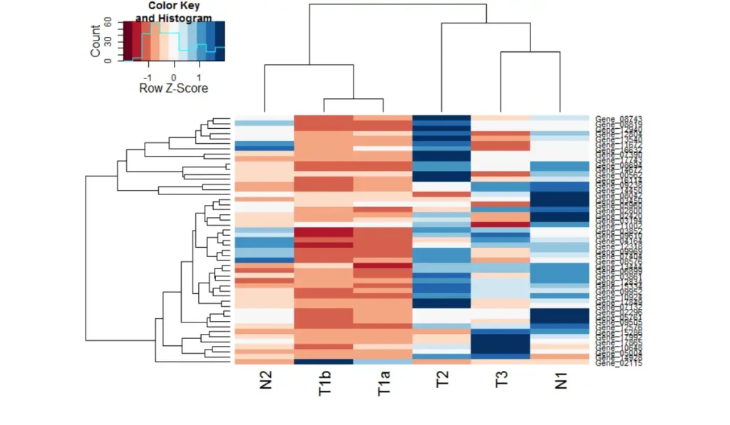
For example, when considering colors of high risk it is advisable to use intuitive colors such as red or green for safe.
These are some examples of heatmap color schemes
- Light blue to dark blue, commonly used for temperature, sales figures, etc.
- Light red to dark red, intensity is often used in gene expression data.
- Perceptually uniform color map from yellow through green to blue which can be useful with a large range of data.
- Diverging the color scheme from blue through white to red is suitable where a departure from a mean value is being portrayed.
- Red through yellow to green is applied for diverging data, which facilitates the representation of deviations separated into positive and negative values.
Categorical scheme with distinct colors for each category, useful in displaying discrete data points.
Interpreting Heatmap Colours
- Higher Values: Usually represented with darker colors or more intense shades.
- Midpoint/Neutral: In diverging schemes, often represented by white or a neutral color.
Heat Map Data Visualization
This table provides a concise overview of heat map data visualization, highlighting its uses, benefits, challenges, and common tools used for creating heat maps.
| Aspect | Description |
| Definition | A visual representation of data using color gradients to depict values. |
| Types | Clustered, geographical, density, calendar, correlation, user activity. |
| Purpose | Identify patterns, trends, correlations, and outliers in complex datasets. |
| Usability | Effective in various fields like business analytics, biology, and geography. |
| Advantages | Provides intuitive insights, and facilitates quick data analysis. |
| Challenges | Can obscure individual data points, and requires careful interpretation. |
| Tools | Excel (conditional formatting), Tableau, R (ggplot2), Python (matplotlib). |
| Applications | Marketing, research, web analytics, spatial analysis, UX/UI design. |
Heat Map Visualization Software
Here’s a list of popular software tools used for creating heat map visualizations:
- Tableau
- Microsoft Excel
- R (ggplot2, heatmaply)
- Python (matplotlib, seaborn)
- QlikView/Qlik Sense
- Power BI
- Google Data Studio
- Heatmapper
- Plotly
- Matplotlib (Python)
What is Heat Map Excel?
In Excel, a heat map is a visual representation of data in which color gradients indicate values. This uses conditional formatting to allocate colors according to the data values.
Thus allowing for quick recognition of trends and discrepancies. It is good for finding trends and identifying outliers between groups or dimensions within spreadsheets and tables, as well as analyzing large datasets efficiently.
There should be A/B testion for the results we get, to use this info for a better outcome.
How to Make a Heat Map Excel?
Below are ten steps that will help you create a heat map in Excel,
- Ready Your Data: Arrange your data in rows and columns, making sure that there is a header.
- Choose the Range of Values: Highlight the part of data you want to be represented as a heatmap.
- Open Conditional Formatting: Under “Home” tab, click on “Conditional Formatting” and then choose “Color Scales.”
- Select Color Scale: Opt for a color scale that closely resembles how your data is distributed e.g. Red-Yellow-Green.
- Implement Color Scale: If you desire to use color scales, just select the desired option for your selected area with ranges of data.
- Tune Color Scale Rules: Finally fine fine-tune color scale rules are required. Choose Manage Rules under Conditional Formatting if needed.
- Create Legend (Optional): In case it is not available by default then add a legend explaining colour values used
- Review and adjust: Take another look at your heat map for clarity and make any format or color adjustments that may be necessary
- Save Workbook: You should save your work in Excel so that it can keep these diagrams
- Update Data (Optional): When the data changes, one can update the heatmap by modifying either the range of cells or refreshing conditional formatting rules.
By following these guidelines, you can create an elementary heat map in Excel for visualizing and analyzing your data effectively.
Heat Map Google Analytics
Although Google Analytics does not have its heat map functionality, you can combine it with other tools to generate heat maps based on user actions and habits on your website. Here is how you can make use of Google Analytics in heat mapping:
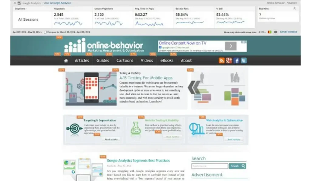
- Integrate Third-Party Tools: Employ third-party software like Hotjar, Crazy Egg, or ClickTale that include heat mapping features.=
- Set Up Tracking: Place the tracking code provided by these tools on your site for data collection to start. Cro tools are tools to know about the site.
- Generate Heat Maps: When the tracking is done, these tools will develop heat maps from user clicks, scrolls, and mouse movements.
- Analyze User Behavior: Through the help of heat maps, see which place users click mostly by,and how far they scroll down a page among other acts of interactions.
- Optimize User Experience: Make good use of insights obtained from the analysis given in the form of heat maps while considering site content placement, layout, and call-to-action buttons for an enhanced user experience and higher conversion rates.
Even though Google Analytics doesn’t create heat maps itself; integrating third-party apps such as these enables you to understand customer behavior on your website more effectively through visualization.
FAQs
Can I create heatmaps with any data analysis tool?
Heatmaps can be made by many data analysis tools such as Excel, R, Python (which use libraries like Matplotlib and Seaborn), or specific software such as Tableau.
Are there any limitations to using heatmaps?
However, heat maps can hide single data points in large data sets, provide faulty results for unevenly distributed information, or may require careful interpretation and proper knowledge to avoid misrepresentation of what is intended.
What is an alternative to heatmap visualization?
Other options are scatter plots, bar charts, line graphs, and bubble charts that also display patterns and correlations within the data with less ambiguous individual dots.
Does Google Analytics do heatmaps?
Through Google Analytics one cannot create heat maps. However, it works with third-party tools such as Hotjar and Crazy Egg that offer heatmap functionality.

